Chinese Web Design: How much of what you know is accurate?
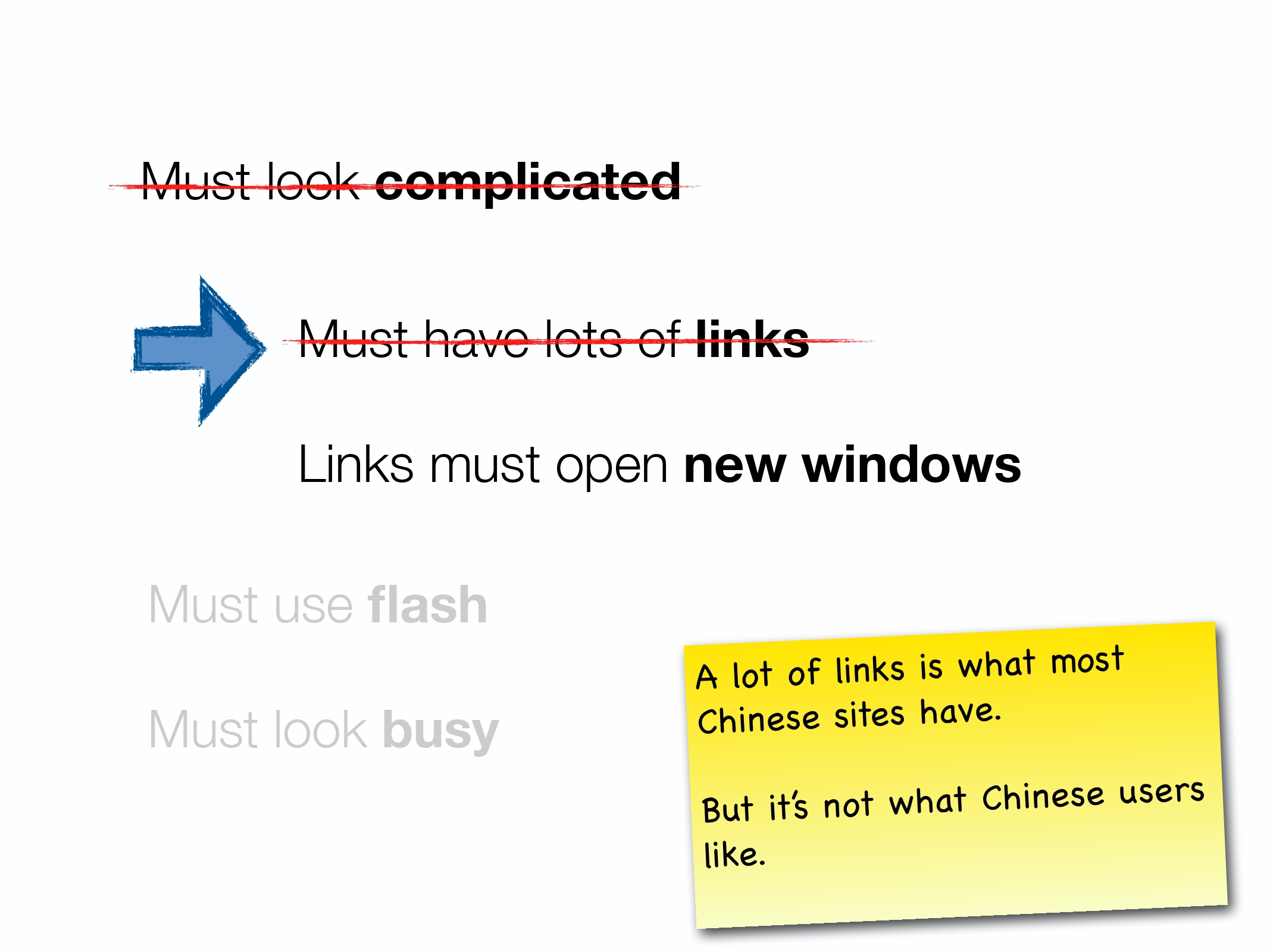
Chinese users like having busy websites, that works better for them; To do well in China, your website needs to have a lot of content and links. That’s how it works in China.
Have you ever found yourself saying something like this or heard someone else says similar things? Well, sorry to have to break this to you, but they are not true.
Here are some key myths about Chinese websites and how they are debunked:
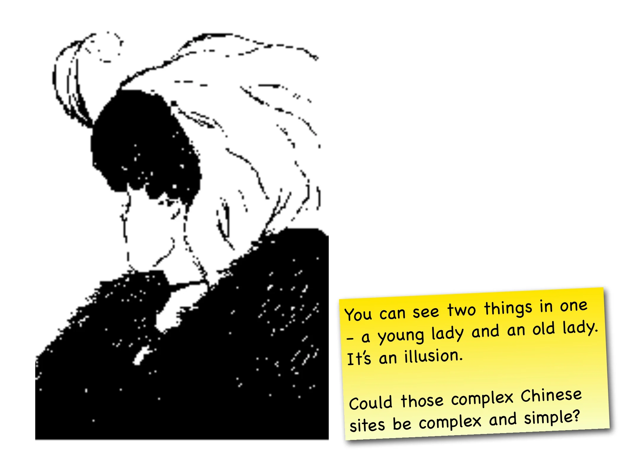
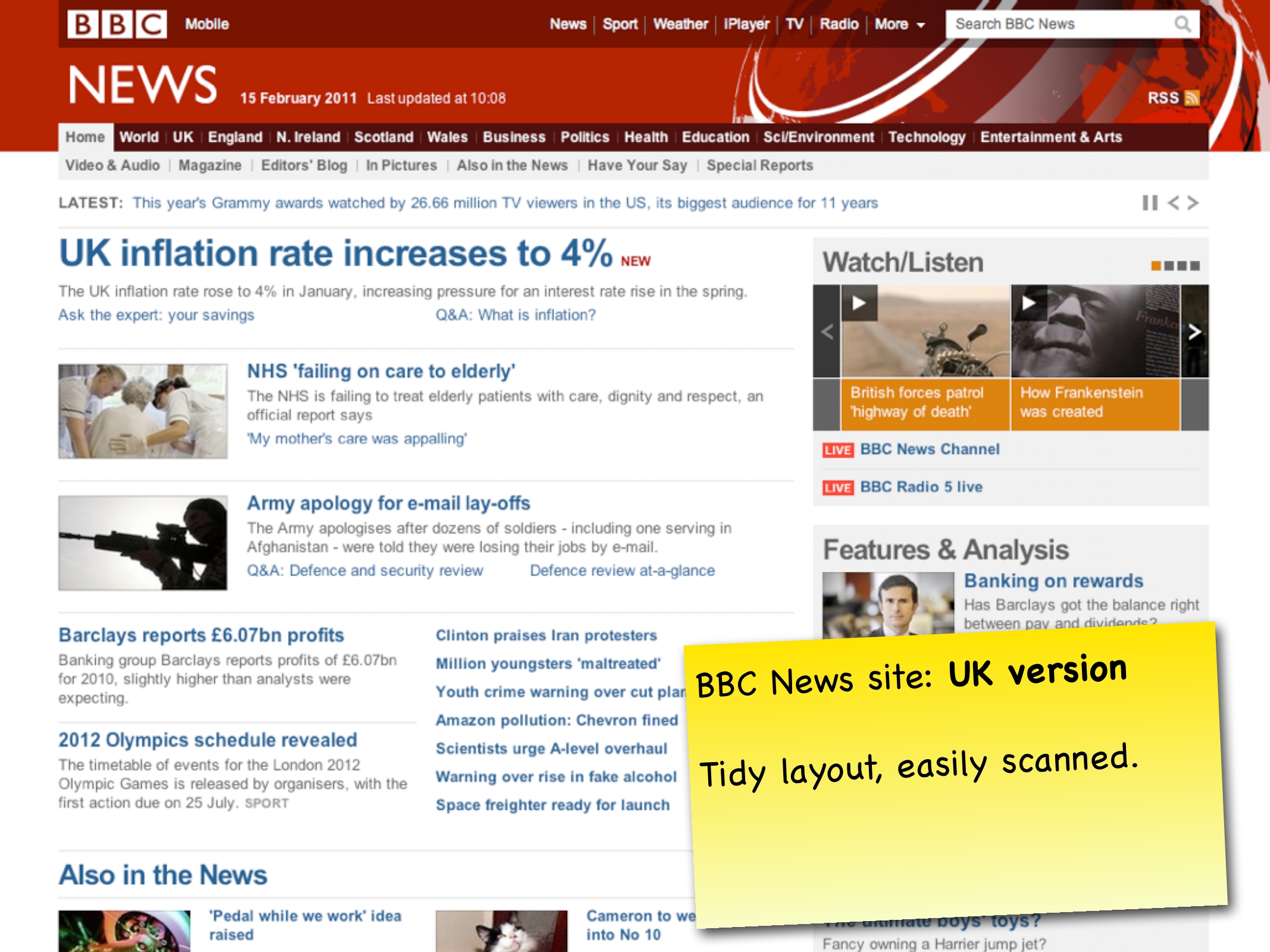
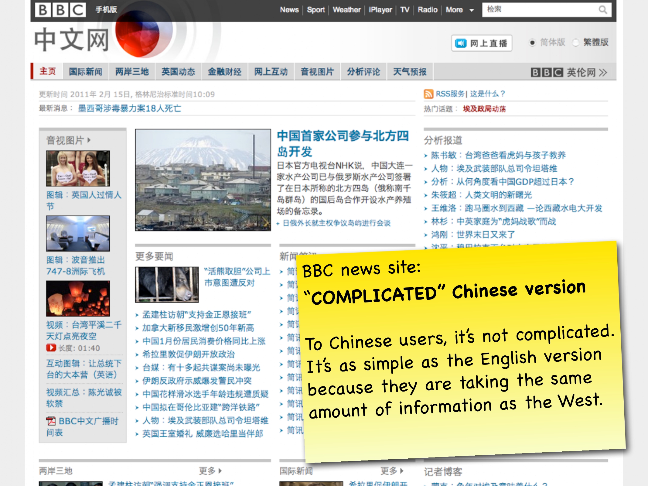
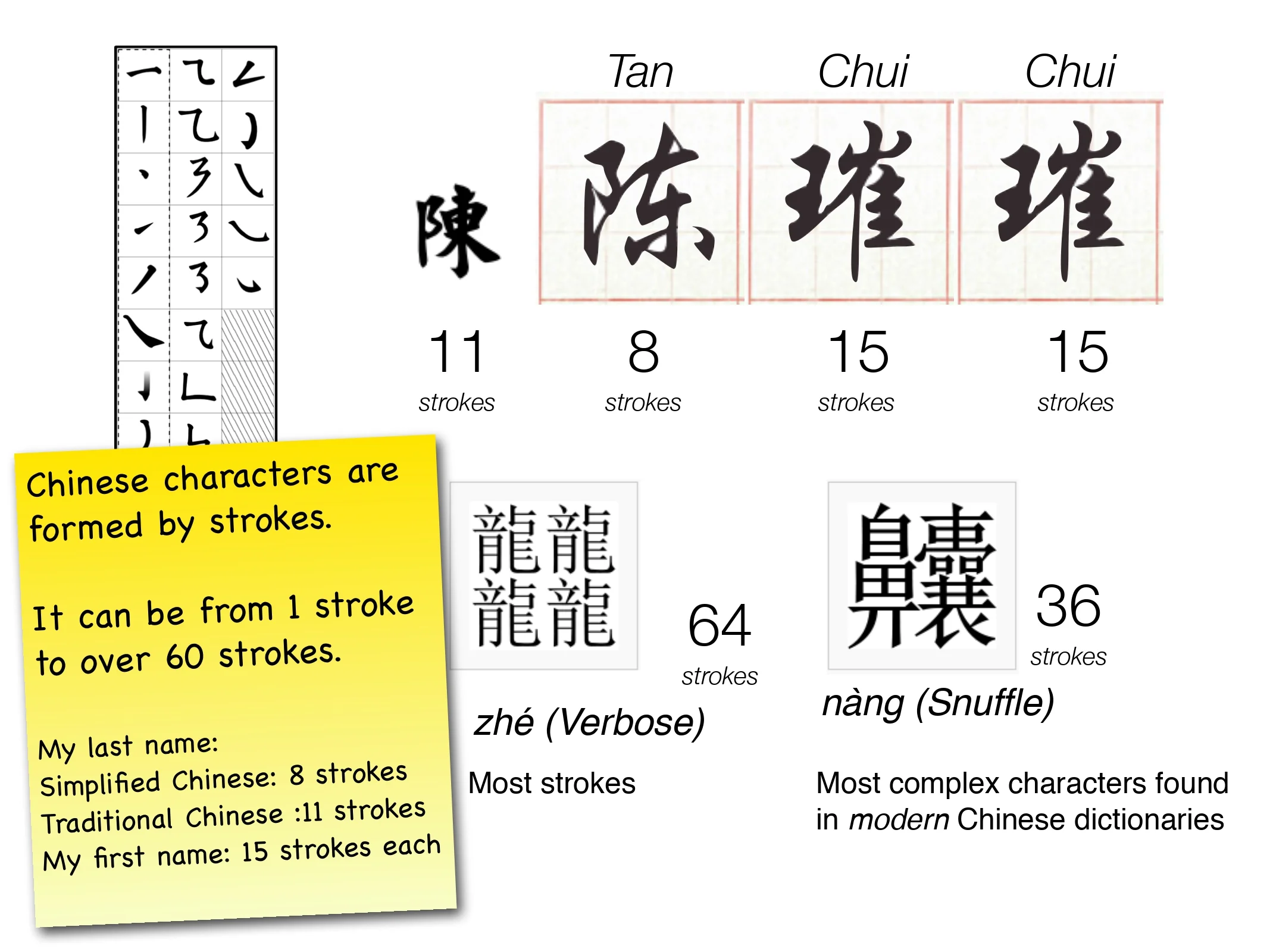
Chinese sites look complicated. It’s not completely true for a few reasons. (1) It might seem to be the case to you who don’t understand the language but not to those who can read Chinese. It could be just an illusion your brain tricks you when you don’t know what you’re looking at; (2) Chinese characters are much more complex than Latin alphabets as each character is formed by strokes; and (3) Chinese writing does not have space between characters. It, therefore, has less breathing space than Latin characters. All these reasons could give the (wrong) perception that Chinese websites often look complicated.
Chinese websites must have plenty of links because it’s more cumbersome to type in Chinese. It’s probably true that there are more links on a Chinese website than for example, a UK or US site. Many suggested that websites are designed for clicking than searching in China because typing in Chinese is cumbersome. Again, it’s not true. By using ‘Pinyin’, Chinese still use the alphabet-based keyboard to input Chinese characters, but it’s faster for them to type in Chinese than in English because that’s what they used to and they are familiar with all the shortcuts they could use to type faster.
All links must open new windows. Links open a new window to support Chinese’ browsing behaviour. They often look at one page while waiting for other pages to load in other windows. This is because Internet speed in China is still relatively slow even though it has the highest Internet population in the world. But such browsing behaviour is likely to change as the internet speed increases in China.
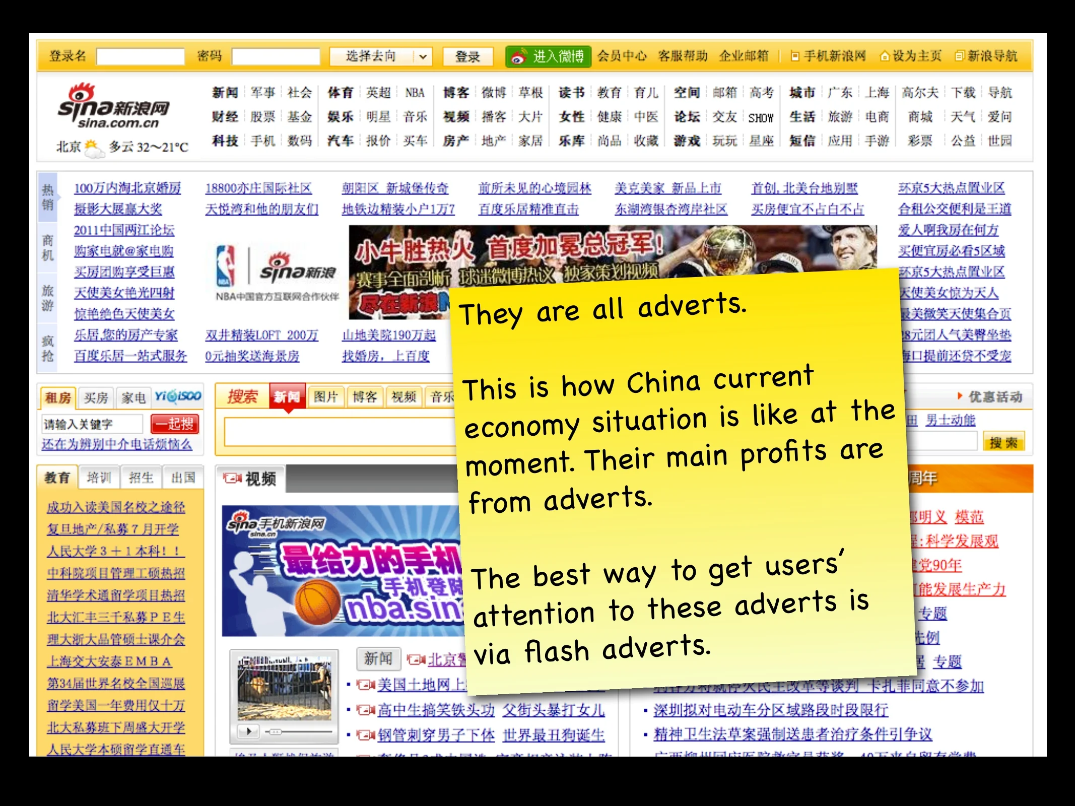
Use excessive flashes as that’s what Chinese users like. Almost all the flashes on the Chinese websites are adverts. The main profits of most websites are from adverts. The best way to draw users’ attention to the adverts is to use flash. But things have been slowly changing. As compared to a few years ago, more and more Chinese websites no longer using flash. There are many web security tools available in China to filter adverts to provide a better experience to the Chinese users. Another reason why Chinese designers often use flashes on websites is because of the limited options for Chinese web typography as it needs to accommodate at least 4000 individual characters. There are not many fancy fonts available. If possible, Chinese users would prefer not to be bombarded with flashy adverts too.
Chinese users like busy websites. Again, invalid statement. Look at Baidu (China’s biggest search engine). It has exactly the same layout and content as Google’s homepage and search result page. What makes a website popular in China is not how busy it looks, just like other parts of the world, it’s the functionalities that the site is providing that support what users want and their social behaviours. For example Taobao.com, Chinese users like using it not because of its colourful, long page. It’s solely because they can buy almost anything from this site with very low price. Users from other parts of Asia are also visiting this website to shop for the same reason.
These are only a few rather inaccurate assumptions that people often made about how Chinese websites should be designed and what Chinese users want. It’s very easy to make assumptions based on what you see and what you hear. This is dangerous. You don’t want to design your websites by purely (and blindly) following the design of others Chinese sites or the ‘localised’ Chinese site of well known international companies. What’s most important is to keep questioning and look into the reasons behind on each design decision made. There is nothing more important than understanding how your Chinese users would be using your website, products and services, and design accordingly.
If you want to know more about China and how to best design for the market, get in touch with us.
We presented this topic at a conference in Atlanta in 2011. The content is still very much valid. There are more insights available in the presentation which are not included in the article. The slide has been very well received on Slideshare (over 107K views).


